Studying/미니 프로젝트
프로젝트 보완하기 - alert창을 toastify로
creamymood
2025. 5. 28. 18:19
하나 둘 배워가는 재미가 있어..
리액트 공부하기 - toastify 라이브러리 초보 설명
조교님이나 동기분들하고 대화하다보면 좋은 꿀 정보를 많이 얻는다 !그 중 하나 toastify.기존 alert 대신에 사용해볼 수 있어서 흥미로워 보였다 ! 라이브러리라 사용도 간편할 것 같았다 🐰🤍 re
creamymood.tistory.com

이렇게 뜨는 alert창을 toastify로 바꿔보자 둑흔

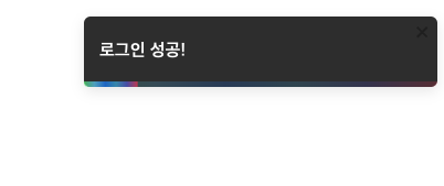
toastify 컴포넌트를 만든 뒤 -> alert 자리에서 import 해와서 사용한다.
또는 간단한 제공 함수를 사용한다.
우선 챗지피티 알려준 자세한 설명은 다음과 같다.
더보기
3. toast 함수를 사용할 유틸 파일 만들기 (선택)
1. 우선 라이브러리 설치
npm install react-toastify
2. toastContainer 전역에서 사용하기 위해 app.js 또는 Root 컴포넌트에 넣어주기
import { ToastContainer } from 'react-toastify';
import 'react-toastify/dist/ReactToastify.css';

function App() {
  return (
    <>
      {/* 다른 컴포넌트들 */}
      <ToastContainer />
    </>
  );
}
3. toast 함수를 사용할 유틸 파일 만들기 (선택)
예: toastUtil.js
import { toast } from 'react-toastify';

export const notifySuccess = (message) => toast.success(message);
export const notifyError = (message) => toast.error(message);
export const notifyInfo = (message) => toast.info(message);
4. 기존 alert("문구") → toast 함수로 교체
import { notifySuccess } from './toastUtil';

// 예시:
notifySuccess("성공적으로 저장되었습니다!");
helper 함수 사용
기존
const handleClick = () => {
  alert("저장되었습니다!");
}
변경 후
import { toast } from 'react-toastify';

const handleClick = () => {
  toast.success("저장되었습니다!");
}
나는 간단히, helper 함수 사용해봤다.
추가 ! 조금 꾸며보기..
helper 함수에도 이렇게 넣을 수 있으니까, 간단히 이런 방식으로 해보기
toast.success("저장 완료!", {
  position: "bottom-right",
  autoClose: 3000,
});
그런데 필요한 부분마다, 이렇게 css나 필요한 것을 적용하긴 귀찮을 것 같으니, 유틸 파일을 만들어두는 편이 훨씬 낫겠다.
색상이나 스타일 지정 하는 법↓
더보기
리액트에서 react-toastify를 사용할 때 색상이나 스타일을 커스텀하는 방법은 여러 가지
1. ToastContainer에서 theme, position, autoClose 설정하기
import { ToastContainer } from 'react-toastify';
import 'react-toastify/dist/ReactToastify.css';

function App() {
  return (
    <>
      {/* 앱 컴포넌트들 */}
      <ToastContainer
        position="top-right"
        autoClose={3000}
        hideProgressBar={false}
        newestOnTop
        closeOnClick
        rtl={false}
        pauseOnFocusLoss
        draggable
        pauseOnHover
        theme="dark" // light | dark | colored
      />
    </>
  );
}
2. 개별 Toast에 스타일 커스텀하기
toast() 함수에 style 객체 전달:
import { toast } from 'react-toastify';

toast('Custom styled toast!', {
  style: {
    background: '#333',
    color: '#fff',
    fontWeight: 'bold',
  },
});
3. className을 사용해서 커스텀 CSS 적용
toast('Hello!', {
  className: 'my-toast',
  bodyClassName: 'my-toast-body',
  progressClassName: 'my-progress-bar',
});
/* 예시: styles.css */
.my-toast {
  background-color: #222 !important;
  color: #ffcc00 !important;
  font-size: 16px;
}

.my-toast-body {
  font-weight: bold;
}

.my-progress-bar {
  background: linear-gradient(to right, #f00, #0f0);
}
※ !important를 붙이지 않으면 기본 스타일에 덮어씌워지지 않는 경우도 있다.
4. 아이콘 제거하거나 교체하기
toast('No icon toast', {
  icon: false,
});
toast('Custom icon', {
  icon: '🚀',
});
5. toast.success, toast.error 등 별도 색상 변경
기본 colored 테마일 때 색상 커스텀은 제한적이므로, className + CSS 방식이 가장 유연하다
toast.success('Success message', {
  className: 'my-success-toast',
});
.my-success-toast {
  background-color: #2e8b57;
  color: white;
}
팁: Tailwind CSS를 쓰는 경우
toast('Tailwind styled toast', {
  className: 'bg-black text-white text-sm',
});